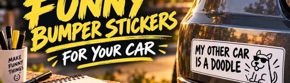
Start with one short joke, give it a clear visual treatment, and test the design at its actual printed size. Use bold lettering, a simple color scheme, and an illustration only when it makes the joke better. Once the design works, prepare it for a printer that offers stickers intended for outdoor use.
A bumper sticker is a cartoon with almost no room for the setup. You get a few words, perhaps a small drawing, and a rectangle on the back of a car. That limitation is part of the fun. “My other car is a doodle” doesn’t need a paragraph of explanation. It needs good lettering and possibly a very questionable drawing of a car.
The trick to designing funny bumper stickers is treating the writing and artwork as one idea. A clever phrase can carry the whole design. An illustration can deliver the punchline. But adding more of both won’t necessarily make the sticker funnier.
Find a Funny Bumper Sticker Idea That Sounds Like You
I’d start with a notebook rather than a design template. Write down small things you find amusing about your routines, hobbies, personality, or vehicle. You might own more sketchbooks than you’ve finished. Your car might make a noise that everyone politely ignores. A five-minute errand might somehow become an afternoon.
Those observations give you something more personal to work with than a slogan copied from a novelty rack.
Try writing ten rough lines without judging them. Then circle the two or three that still make you smile when you read them again. At this stage, awkward wording is fine. You’re finding the idea, not approving the final artwork.
Here are a few directions to experiment with:
| Humor style | Example starting point | Possible visual treatment |
|---|---|---|
| Gentle self-mockery | “Professionally Overthinking This” | A tiny tangled thought bubble |
| Artist humor | “Licensed to Buy Art Supplies” | A pencil standing in for a key |
| Affection for an old car | “Emotionally Attached to This Rattle” | A small heart beside a loose bolt |
| Absurdity | “Caution: Unfinished Ideas” | A deliberately incomplete lightbulb |
| Hobby humor | “One More Side Quest” | A simple winding path |
Treat these as prompts rather than a finished collection. Change the wording until it sounds like something you would actually say.
And consider the difference between laughing at yourself and scolding everyone behind you. My preference is the former. A sticker about your commitment to unnecessary art supplies has more charm than another complaint about other drivers.
Cut the Setup and Keep the Funny Part
An early draft often contains the explanation and the joke. Your next job is separating them.
Suppose you write:
“I spend so much money on art supplies that I can’t afford a nicer car.”
That gives you the idea, but it asks the sticker to do too much explaining. Try:
“My Car Budget Bought Paint.”
Or take it somewhere more visual:
“The Good Car Is Still a Sketch.”
Neither version is automatically the winner. The point is to explore what happens when you remove the supporting sentence and let the reader make the connection.
For a first design, I’d aim for roughly three to eight words. That’s a useful creative constraint, not a fixed rule. A slightly longer line can work when the wording is familiar and the layout stays clear. Bumper-sticker printing guidance generally favors short messages, legible fonts, strong contrast, and minimal clutter.
Read each version aloud. Does it sound natural? Is the funny word buried halfway through? Could you remove one more word without losing the meaning?
You’re editing for timing as much as length.
Make the Illustration Earn Its Space
A drawing should add something the words aren’t already doing.
For “The Good Car Is Still a Sketch,” you could place a loose pencil drawing of a sports car beside the text. The contrast between an ambitious sketch and an ordinary vehicle supplies part of the joke. You don’t also need paint splashes, three pencils, a frame, and a background pattern.
I like three possible arrangements for this kind of project.
Text first: Let the wording occupy most of the sticker. Add a small drawing as a finishing detail.
Picture first: Use a large, simple illustration with a short caption. This works well when the visual itself is the joke.
Words and picture together: Replace one element with a drawing, or let the illustration interact with the lettering. An unfinished lightbulb above “Unfinished Ideas” is one option.
Sketch all three as small thumbnails before polishing anything. Keep them rough enough that throwing one away doesn’t feel painful.
You can also borrow the visual language of familiar objects without copying a finished design. A serious-looking label carrying a very unserious message can be funny because the format and wording disagree. The important part is the contrast, not reproducing someone else’s logo.
Use Lettering That Helps the Joke Land
Typography is part of the delivery. A dry, deadpan line might look better in plain block lettering than in a playful font that announces how funny it intends to be.
Start with one typeface. Give the main phrase enough room, and use size or weight to emphasize the important part. Add a second font only when it creates a clear distinction, such as a small introductory label above a larger punchline.
For example, you might set “CAUTION” on a modest top line and “UNFINISHED IDEAS” beneath it. The second line should not become tiny just to make the first one look impressive.
Keep the background simple while you work. Black lettering on white or yellow, or white lettering on a dark field, gives you a straightforward place to start. Strong contrast and uncluttered layouts are also consistent with established bumper-sticker design guidance.
For hand lettering, check the less glamorous details. Are the spaces between words obvious? Does an “R” look like a “P”? Have two letters accidentally joined into another shape?
A slightly uneven line can have personality. An unreadable line just needs another pass.
Choose a Design Tool That Fits the Artwork
You don’t need to learn a professional illustration program to arrange a sentence and a small drawing.
Canva is a practical starting point for a text-led design. Its sticker tools support templates, uploaded artwork, text, and graphic elements. I’d begin with a restrained layout rather than choosing a busy template and trying to remove half of it.
For custom drawing and lettering, consider Adobe Illustrator or Inkscape. Illustrator is designed for vector artwork. Inkscape also creates vector graphics, which describe shapes with lines and curves rather than a fixed grid of pixels. That makes vector artwork useful when the same design needs to be resized.
Hand-drawn artwork is another option. You can draw on paper, capture the artwork cleanly, and arrange it with digital text. Just remember that a scanned or photographed drawing is a pixel-based image unless you redraw or trace it into vector shapes. Enlarging a small raster image can reveal pixelation.
Choose the tool that lets you finish the idea. A simple sticker doesn’t become better because the software was harder to learn.
Test the Sticker Before Ordering It
Print a paper version at the size you intend to order. Turn off any setting that automatically shrinks or enlarges the page, then measure the result.
Hold the paper mockup near the intended location on your parked car. Step back and look at it without studying it. Ask another person to read it without explaining the joke first.
I’d use three questions:
- What did you read first?
- What do you think the joke means?
- Was anything difficult to make out?
Those questions are more useful than “Do you like it?” They reveal whether the design is doing what you intended.
When something feels wrong, change one thing at a time. Enlarge the lettering before replacing the font. Remove an illustration before adding an outline around everything. Try a shorter phrase before increasing the sticker size.
The paper version is your opportunity to make cheap mistakes.
Choose Outdoor Printing for the Finished Design
For a sticker you intend to leave on a car, use a product made for that application. Custom bumper stickers from CustomStickers.com are offered in laminated vinyl with matte and glossy finishes. That gives you a way to print your own artwork without buying a printer or cutting equipment.
Home printing is also possible with a compatible material system. Cricut’s Printable Waterproof Sticker Set, for example, combines printable vinyl with a laminating sheet and requires an inkjet printer. Its instructions also warn that ink formulations vary and some colors may fade, so “waterproof” should not be treated as a promise that every home-printed design will stay unchanged in sunlight.
My preference would be to use ordinary paper for design experiments and order the finished car sticker once the joke and layout are settled. That keeps the creative part separate from learning an outdoor-printing workflow.
Funny Bumper Sticker Design FAQs
Do I need an illustration?
No. Try the wording by itself first. Add a drawing when it contributes a second layer to the joke or makes the idea clearer. Decorative artwork is optional.
Should the entire sticker use capital letters?
Not necessarily. Try both uppercase and mixed-case versions at the finished size. Choose the one that makes the phrase easiest to understand and gives it the right tone.
What should I do when the joke needs an explanation?
Rewrite it or save it for another format. A longer idea might make an excellent comic, greeting card, or social post. There’s no reason to force every joke into a bumper sticker.
Keep the Joke, Lose the Extra Work
The best place to spend your effort is on the idea and its delivery. Find a line that sounds like you, sketch a few possible treatments, and remove anything that competes with the funny part.
Then check the design away from your screen. A paper mockup can tell you what another hour of adjusting shadows won’t.
Start with one sticker you genuinely enjoy. It doesn’t need to entertain every person in the parking lot. It needs to feel worth putting on your car.